The Ergonomics And User Experience Of FIMA Fittings
Posted on Nov 24, 2022

A design process that considers the market needs and the user’s interaction with the product.
The next logical step in FIMA’s design process is to move from the ergonomics principles to the user experience.
When we create a new collection, we immediately picture it in relation to the user. This is a part of our big-picture vision.
The objective is to create an immediate bond between the user and the product through simplicity and learning to use. Amplifying the positive emotions that result from it due to its functionality and the enjoyment of the experience itself.
In light of this, even though we deal with anthropometric and functional design to guarantee the products’ health and safety, they are insufficient.
Advancing is necessary. We must create a more intricate process that combines technical expertise with a design sensibility that can interpret the market’s needs, which are increasingly influenced by digital tools that change how people interact with neighbouring products.
Therefore, highlighting some of these features in the newest collections in the catalogue is an exciting way to talk about design details that, despite being less obvious, are a significant benefit of selecting Fimacf.
FLO’S AESTHETIC & FUNCTIONAL CLEANLINESS
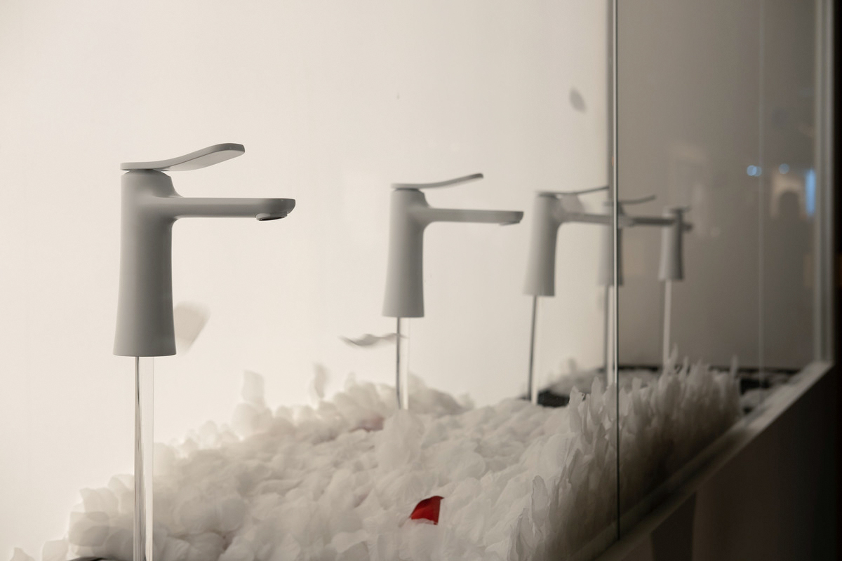
At the Milan Supersalone furniture fair, the new FIMA proposal, known as FLO, made its debut. The market accepted it right away(we talk about it here). Since the collection was also meant for contract projects, the emphasis was on making it lightweight, elegant, easy to use, and versatile in terms of setting and installation. With this brief as a starting point, FIMA’s technical division articulated FLO’s vision through a series of creative decisions regarding experience and usability.
One specific product maintenance and installation option are concealed behind the mixer’s supple and sinuous lines. Cleaning can be done more easily and quickly, which is crucial in the contract and hotel industries by eliminating sharp edges and places where limescale can accumulate.
The downward tapering body provides a broad and stable support base by eliminating the need for rings or bases, which are more challenging to install. Last but not least, the raised position of the cartridge prevents water infiltration, ensuring longer-lasting flawless product performance.
FIMA’s design methodology consistently considers and invests in practical aspects, not just those associated with water delivery. The well-being and desirability of products are, however, also closely related to aesthetic decisions in terms of ergonomics and user experience.
The visual appeal of the collection in FLO’ is primarily determined by connections between surfaces and the harmony of proportions. FIMA opts to concentrate on the cleanliness of lines and only suggests a pop-up plug system by completely hiding mechanical details like pins or holes from view. Additionally, due to its adaptability to non-standard installations, the result is an aesthetically stunning fitting from every angle that is simple to approach and use in interior design projects.
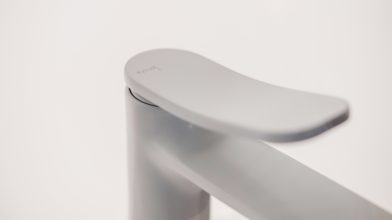
Another benefit of the FLO collection’s user interface is the way it entices users to use it. Because the gesture is so appealing, you are immediately enticed to open the tap. This is made possible by the lever’s size and length, which make it easy to grasp, as well as a unique mechanism that enables the lever to slide gracefully forward.
SWITCH IMMEDIACY & SWITCH ON GESTURES
Davide Vercelli’s design philosophy for the SWITCH collection and its sibling collection, SWITCH ON, is based on gestures. Engagement with a product depends on developing a habit or using it intuitively, perhaps by imitating a gesture from another routine task.
This is the situation with SWITCH, where pressing a button initiates and terminates water flow just like any other on/off switch in an electrical system or appliance. Applying a previously learned and internalised gesture to a novel object that might otherwise be difficult to understand from a formal standpoint makes the product immediately approachable and even intriguing, luring the user to interact with it.
The user experience is directly influenced by more than just the SWITCH interface. The same reflection offers a variety of composition and distribution options, which extend to the entire system. From a design perspective, these options should be used to meet the user through the careful installation. A crucial element that influences the well-being and enjoyment of the experience and forges an enduring bond with the product
Lastly, creating a slimmer, flush body enables the product to be lightweight, portable, simple to handle, and visually unobtrusive. This is crucial, especially in the case of the SWITCH ON sister collection, which goes beyond a shower system to include the entire bathroom.
There are four versions of SWITCH ON with a bidet, basin mixer, and built-in bath and shower fixtures. The integration of the hand shower, the division of the controls for on/off, temperature, and flow are excellent examples of a successfully solved design issue.
Modifying WELLNESS WITH SO
Every mixer is built around the idea of adjustment, which refers to selecting the precise temperature and flow ratio that, in the user’s opinion, satisfies their desire. Designing to make this blending simpler, more accurate, and more dependable involves addressing well-being and usability, which indirectly affects ergonomics and user experience.
SO makes a statement at this point. Davide Vercelli’s creative mixing concept clearly distinguishes between the temperature and the flow rate, rendering these elements independent of one another. The level of comfort that the product provides improves with increased control. Many aesthetic and material decisions that support well-being also make it easier for the user to connect with SO immediately.
The two controls are different in size and shape, with one having a broader cylinder that is easier to hold for adjusting the flow rate and the other having a taller, slimmer control for precisely adjusting the temperature.
The straight edge, which is part of the cylinder’s sectioned side, makes it possible to quickly determine the temperature of the water and maintain the same setting. FIMA suggests combining various materials, such as concrete and wood, as an alternative to the more traditional galvanic or chrome finishes to emphasise the two knobs’ different functionalities further. This broadens the interface and gives the product more customisation options, immediately improving user-friendliness.


